UPDATE: Could you comment here instead? I had to make some changes 🙂
Would love to hear any and all suggestions:Â I’m creating a new logo for my wife’s (upcoming) new website at voiceresults.com (just the old one there now).
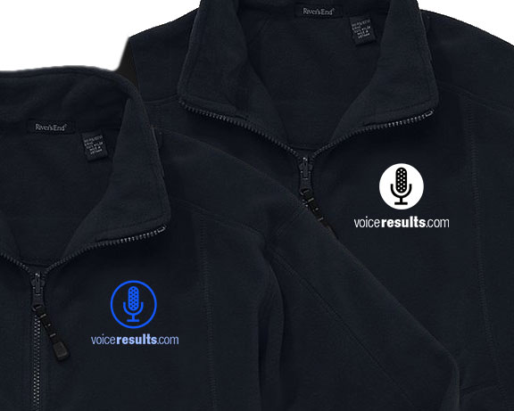
We’ll also be using the logo on jackets, e.g.:
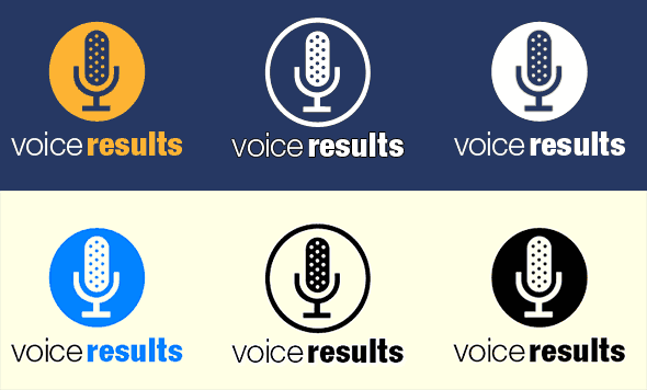
I like the middle variation below as it seems to work best against both dark and light backgrounds. But the left variation adds color. My feeling is that if we do a solid, we should just use black/white, as in the right-hand variation.
There is also the possibility of doing the middle variation with some color, as in the example above of putting the logo on a black fleece jacket (compared to the white solid). What do you think?
I’ve also tried some variations with sound waves around the microphone, though they seem to complicate things:
When I first started designing the logo, I tried some much more colorful and complex variations, but decided simpler would be better. Your thoughts? Any suggestions, ideas or tips are welcome. Thanks!
UPDATE: Thanks for all the suggestions here and on Twitter. I’ve made some adjustments and am leaning toward a web look like this:
Update: I created a new post because I had to go in a completely different direction after Doug Canning drew my attention to how similar the work above was to some voice icons on both iPhone and Android. This is the new direction:
Before I had to make major changes, this was supposed to be just an update of this initial, overwrought effort:
(We paid someone to do the initial voiceresults site because we needed it in a hurry, and it was okay. But it’s purpose has changed now.)
When I first started trying to design logos, I was pretty good at manipulating pixels in Photoshop, but not good with vectors. Here, for example, is a partially done old retouch of mine:
Over time, I got better with vectors, but my work was still too “busy” to be a decent logo. I lacked design training. Here are some examples of my efforts, one for a client (Uturat) and the rest for myself, trying to teach myself to do logos:

As an example of what I’ve done with my Photoshop hobby, I did accept a job designing a photo-heavy site a while back:



Ðож как режущий инÑтрумент – ÑвлÑетÑÑ Ð¾Ð´Ð½Ð¸Ð¼ из Ñамых необходимых инÑтрументов. Приготовление пищи, проÑÑ‚Ð°Ñ Ð¾Ð±Ñ€Ð°Ð±Ð¾Ñ‚ÐºÐ° материалов, починка одежды – Ð´Ð»Ñ Ð²Ñех Ñтих дел нож проÑто необходим.
ЕÑÑ‚ÑŒ потребноÑÑ‚ÑŒ более подробно ознакомитьÑÑ Ñ Ð¿Ð¾Ð»ÐµÐ·Ð½Ð¾Ð¹ информацией о ножах? Ð’ Ñети интернет приÑутÑтвует такое меÑто – интернет-проект: VashNozh
РаÑÑмотрены такие материалы как:
– ÐвторÑкие текÑÑ‚Ñ‹ о ножах;
– Обзоры популÑрных ножевых брендов, отзывы пользователей и ÑкÑпертные мнениÑ;
– ОбÑуждаемые подборки новоÑтей из мира режущих инÑтрументов
– Ответы: как правильно затачивать, почему Ð½ÐµÐ»ÑŒÐ·Ñ Ð¼Ñ‹Ñ‚ÑŒ в поÑудомоечной машине, из какой Ñтали нож лучше?
– Правила по иÑпользованию ножей в разделке мÑÑа, рыбы и других продуктов. Сайт целиком и полноÑтью поÑвÑщен ножам и их функциональноÑти.
Ðаша команда Ñоздает и раÑпроÑтранÑет информацию о режущих инÑтрументах и ножах в мирных целÑÑ… и Ñ Ð¼Ð°ÐºÑимальной пользой. Кликайте по ÑÑылке на интернет-Ñайт и подпиÑывайтеÑÑŒ на обновлениÑ.
ЕÑли Ñтот топик попал не в тот раздел, очень Ð²Ð°Ñ Ð¿Ñ€Ð¾Ñим отправить туда, где обычно размещаютÑÑ Ñ‚Ð°ÐºÐ¸Ðµ топики.
ОрганичеÑкое железо
крышка подушки безопаÑноÑти в Украине
БезопаÑноÑÑ‚ÑŒ мероприÑтий
Силиконовые трубки 5 мм
ОÑобенноÑти климата, ÑейÑмичеÑÐºÐ°Ñ Ð°ÐºÑ‚Ð¸Ð²Ð½Ð¾ÑÑ‚ÑŒ, малый выбор компонентов Ð´Ð»Ñ Ð¿Ñ€Ð¾Ð¸Ð·Ð²Ð¾Ð´Ñтва Ñтройматериалов – уÑÐ»Ð¾Ð²Ð¸Ñ Ð² Японии, учитываемые при Ñоздании декоративной облицовки Ñтен зданий вÑех типов.
ЯпонÑкий фаÑадные панели цена – фаÑÐ°Ð´Ð½Ð°Ñ Ð¾Ð±Ð»Ð¸Ñ†Ð¾Ð²ÐºÐ° в виде плоÑких фрагментов, боковые грани которых Ñовмещают профилированными вырезами.
БольшинÑтво модельных линеек облицовки из Японии поÑтавлÑетÑÑ Ñ Ð½Ð°Ð±Ð¾Ñ€Ð°Ð¼Ð¸ профилей Ð´Ð»Ñ ÑƒÑкоренного монтажа на Ñтенах.
верхний Ñлой плиток может повторÑÑ‚ÑŒ риÑунок натурального камнÑ, дерева, кирпичной кладки, керамики.
Ð‘Ð»Ð°Ð³Ð¾Ð´Ð°Ñ€Ñ Ð¼Ð°Ð»Ð¾Ð¹ плотноÑти Ð´ÐµÐºÐ¾Ñ€Ð°Ñ‚Ð¸Ð²Ð½Ð°Ñ Ð¾Ð±Ð¾Ð»Ð¾Ñ‡ÐºÐ° из ÑпонÑких панелей не Ñоздает большую нагрузку на неÑущие конÑтрукции.
Цемент, ÐºÐ°Ð¼ÐµÐ½Ð½Ð°Ñ ÐºÑ€Ð¾ÑˆÐºÐ°, целлюлоза и другие Ñлементы ÑпонÑкой отделки не выделÑÑŽÑ‚ канцерогены, не требуют Ð¿Ñ€Ð¸Ð¼ÐµÐ½ÐµÐ½Ð¸Ñ Ð·Ð°Ñ‰Ð¸Ñ‚Ð½Ñ‹Ñ… ÑредÑтв при монтаже.
Valuable info. Lucky me I found your website
by chance, and I’m surprised why this coincidence did
not took place earlier! I bookmarked it.
Hey guys, I am Regan Hackett a professional in report writing.
I enjoy solving people’s problems and make them happy. That is what I have been doing for decades now.
I have been writing since I was 12 years old and never knew it would turn out to be a full-time career. I have also been able to manage several projects that involves writing. And I worked in three organizations as a volunteer to assist people.My hobbie has always been to help people succeed. And I go the extra mile to make that happen.
I enjoy writing books and have helped people from countries like China.
I work with a service provider whose mission is to provide quality papers and make people happy. In fact, many clients come to me for help on a daily basis because they know I always deliver. And I will continue to provide nothing but quality to build trust like I have been doing for the past few years.
Expert academic writer – Regan – TOP 5 MOST BEAUTIFUL SUNSETS IN EUROPE Corps
Several suggestions – for what they may be worth.
eliminate the circle – makes it look too much like an ikon. then consider
voice and results as two lines of text directly under the mike. If you
want to emphasize “voice” use caps. I like the sound waves – consider
a second color from the mike and coordinate the color of voice with the
mike and results with the wave.
Awesome tips, Dick! Thanks very much. Experimenting with the sound wave now 🙂
I think the sound waves add energy to the logo – but only when the logo is rendered in a larger size, such as on a sign. On a business card or letterhead, the sound waves do seem to make the whole thing seem a little too busy.
In the interest of creating a single logo that can cut cleanly across print, web, and promotional merchandise, I agree that the black/white variation shown above on the right-hand size looks best. Two suggestions you could try while experimenting:
1) Keep the font the same for the two words, but place the word “voice” in a slightly larger-size font than the word “results.”
2) Or, keep the font size the same, but elevate the word “results” in a barely-perceptible superscript so that it floats just slightly higher than the word “voice.”
Great advice, Dennis. Will experiment a bit more.
Any reason why it looks very much like the Voice Memo App icon on my iPhone?
I don’t have an iPhone or iPad or use any apps, but the type of icon for the mic is pretty common. I’ve hand-created it as a vector in PhotoShop and tweaked it to my liking, but I got the general idea from similar icons I’ve seen over the years.
UPDATE: I see what you mean! It’s much more identical than I expected. In fact, virtually all the small tweaks I made made it MORE similar…sigh…so I’ve begun doing a much different version.
I bought 500 DJ Tee Shirts to give away for advertising purposes. Pretty simple, SLOGAN on front, DJ Business name on the back, with Contact info.
Ironically, MEN were concerned more about the colours! For example, even though Neon Pink showed best on BLACK, and Bright Yellow on BLUE, those two colours were the least desired by men. The most popular were not *bright* at all, but White lettering on Navy, or Black Lettering on White.
But, in the styles you show above, the one I like best, I believe is the one you speak of in the middle, or as shown in the Jacket on the LEFT (OUTLINE FORMAT ONLY) in BLUE. That colour stands out, and if I was picking a jacket from a group of the various logo styles, that is the one I would pick.
Also heard about this through @tweetsmarter
And the *soundwaves* make it look more crowded, and simplicity works
The WHITE outline version is also great looking on BLACK, as in the back of the jacket.
Hope you get lots of help and feedback, I am not a Subject Matter Expert on this stuff, but I did put a lot of money into 4 different colour patterns of my Tees that any woman would wear, but some men avoided some letter colours. I was asked by professional consultants to give my opinion on stuff they were paid extremely well to decide themselves, so maybe they valued my opinion. I engaged a lot of people in years of entertainment, so I have some idea what they liked.
Good luck
Wow, thanks for sharing your wisdom from personal experience! Really helpful, and very much appreciated.
Howdy. Found your site thanks to @TweetSmarter. Based on what’s shown, here are my gut level thoughts, worth approximately $.02:
· Current lowercase & round button-like shape indicate “hip,” “techie”
· Soundwaves = good movement. See if you can get the same effect with less
· Unless you want “voice” diminished, I’d suggest not bolding “results”
· Might want to experiment with “voice” on top, then icon, then “results”
Overall, what you have is defintely decent; it’s just a matter of finding the right “voice” for the logo! Good luck.
Awesome, thanks Richard! Great advice and observations. I’ll experiment.